Boyce Podiatry
Brand refresh for a Havelock North based podiatry business.
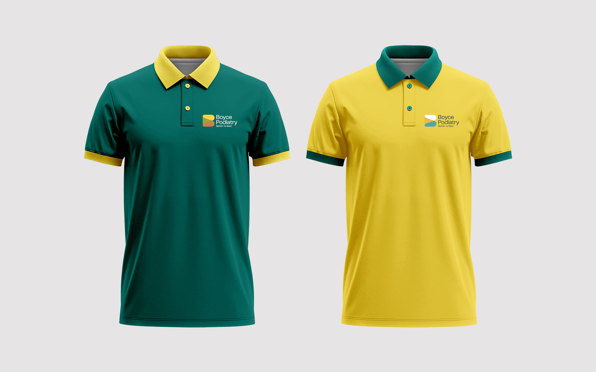
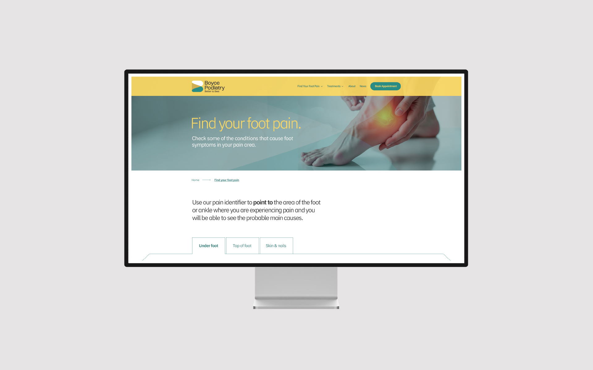
Brand

Logotype + design
Boyce Podiatry are are podiatry business that had a brand in need of updating.
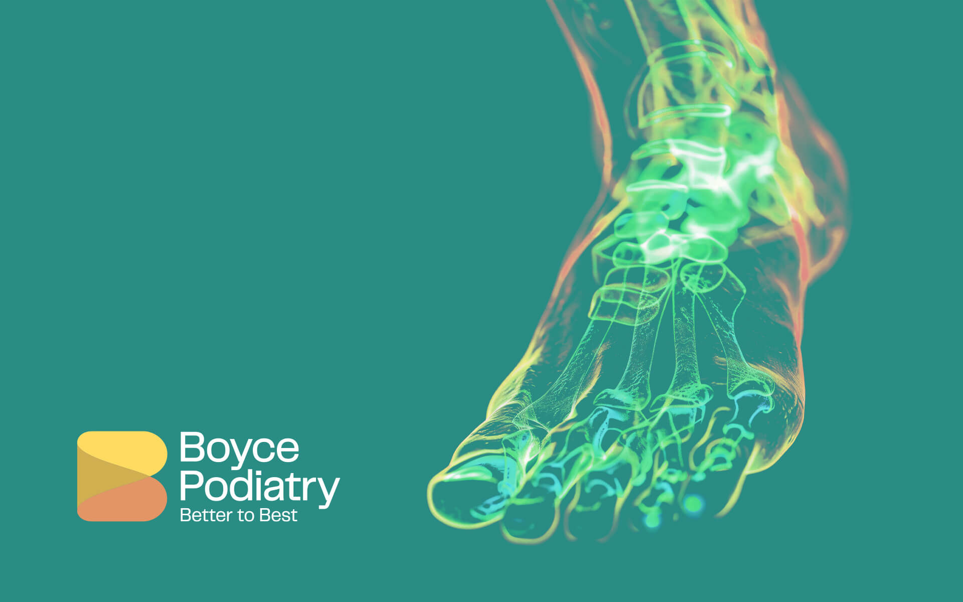
It was important to have the brand have both strong and approachable. The brand designs are aligned with these values, but careful consideration was made to create a brandmark that embodies natural professionalism, that has a timeless sense about it. The brand colours was derived from the sculpture colour palette which sits on the wall in the reception, as the client requested. It was also important when considering the brandmark to be confident and well considered and not be too literal or try to represent foot care in a literal sense as this can become clichéd and over-delivered with regard to the brand icon.