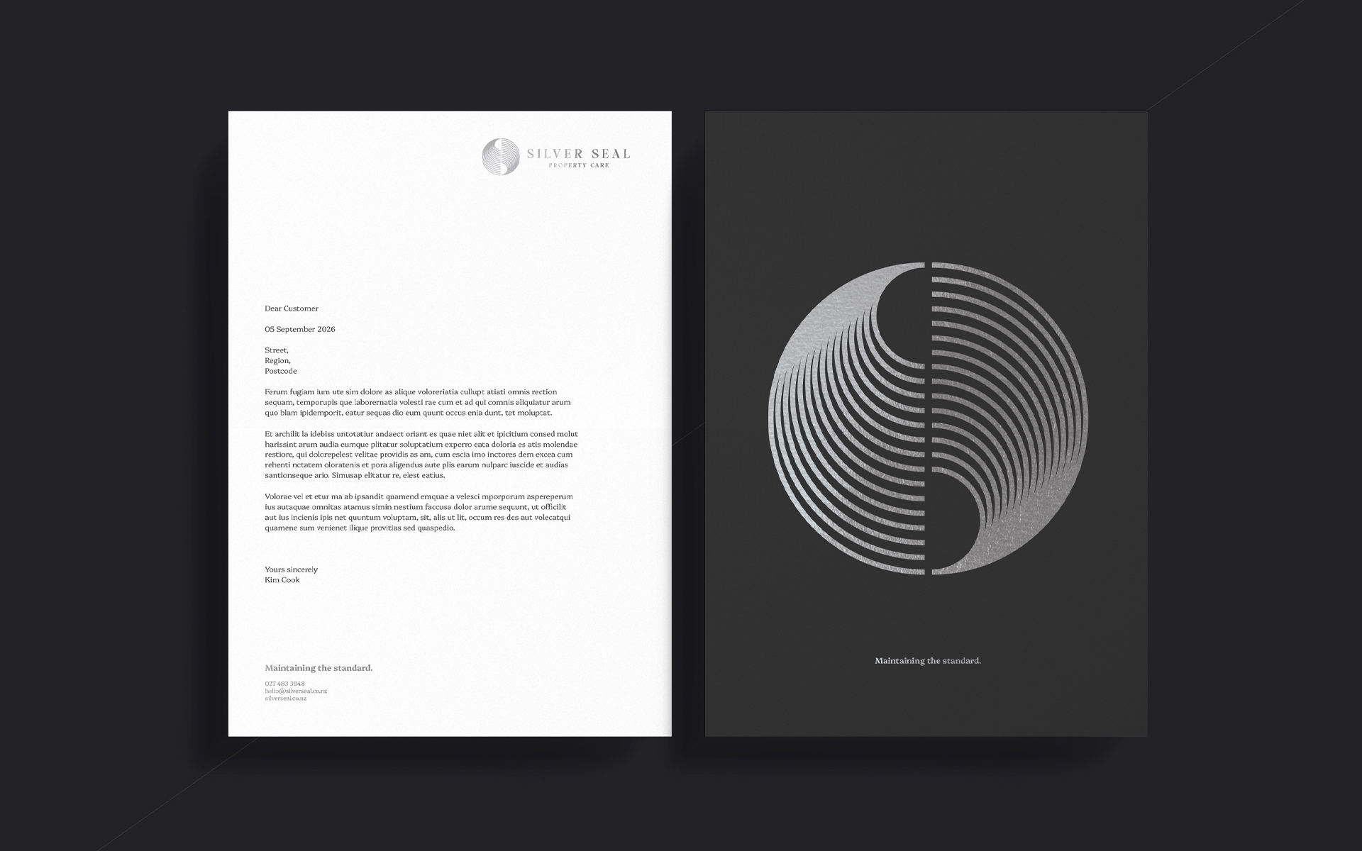
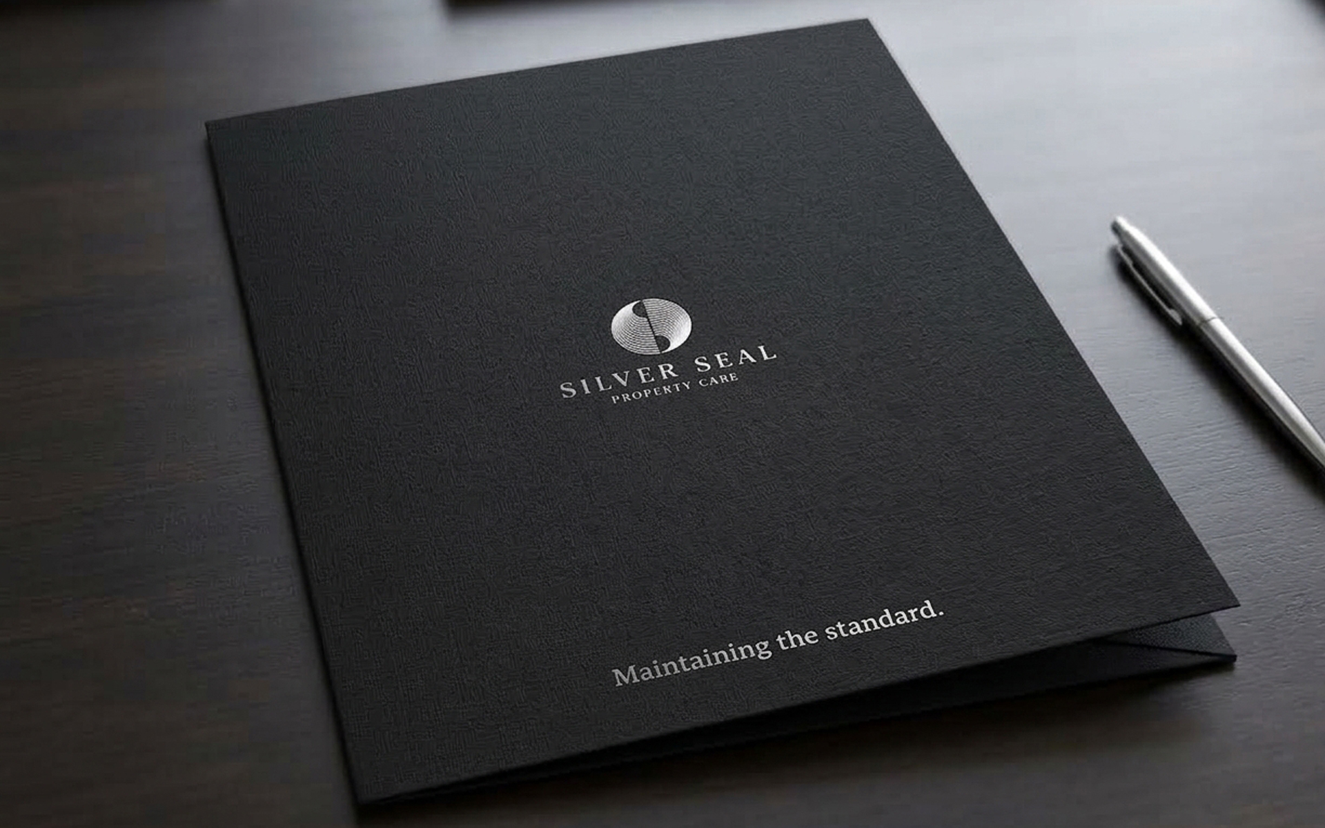
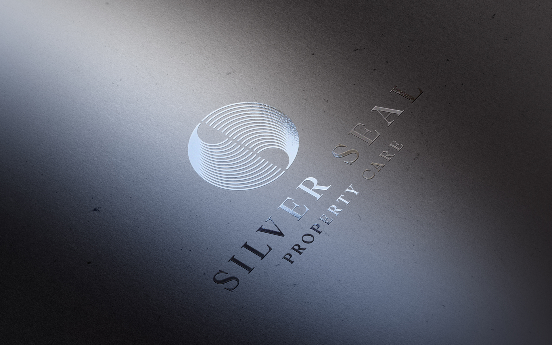
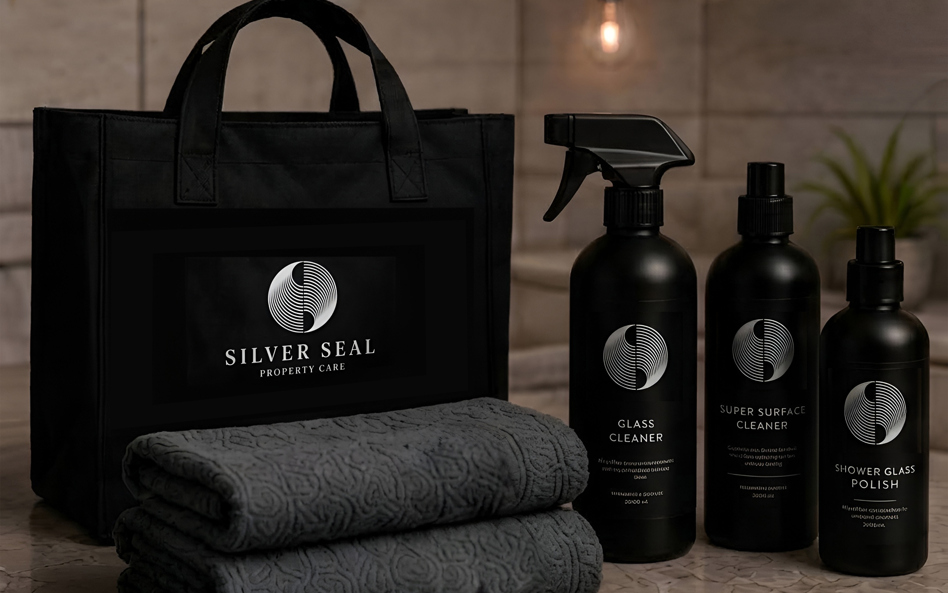
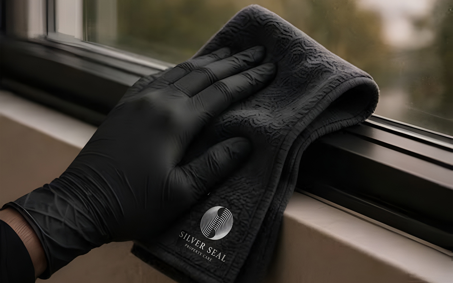
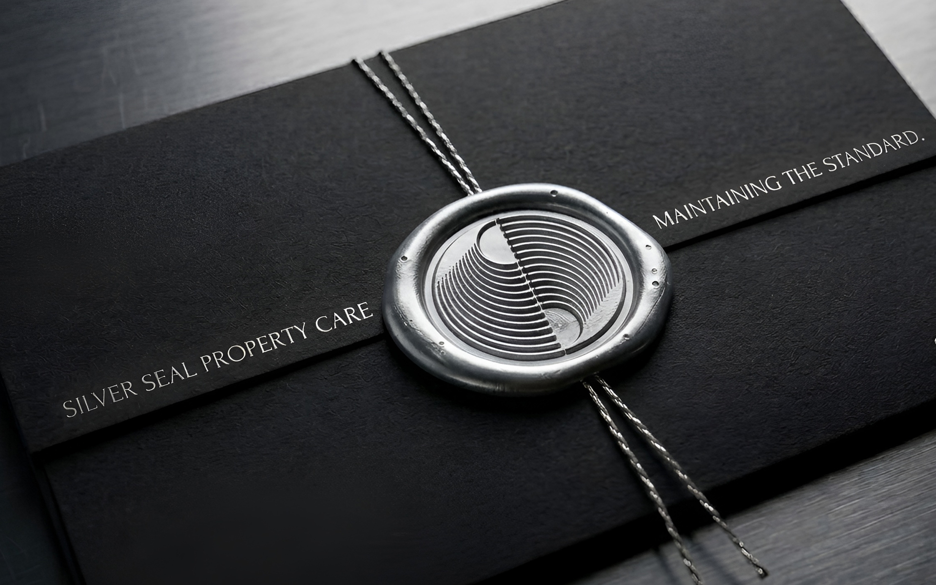
the brand mark uses an a stylish, ornate ‘seal’ emblem, which is both visually appealing and dynamic at the same time. It reflects a clean, confident attention to detail and an overall ‘shine’. It also echos interlocking ‘S’ shapes.
- Art direction
- Brand design
- Presentation visuals
Details
Silver Seal is much more than a window cleaning business. The vision is to create Hawke’s Bay’s leading premium property care company a business recognised for meticulous standards, trust and long-term relationships. This brand is something intended to build over decades, not just the next few years. It wants to be visual identity that still feels timeless and relevant in 20 years.
Aligned with Silver Seal’s ethos on delivering high quality services with a real emphasis on the resulting aesthetics of a beautiful end finish. With this in mind I aimed to make the brand marks to more a visual idea and less specific, so they have more allure and will stand the test of time.