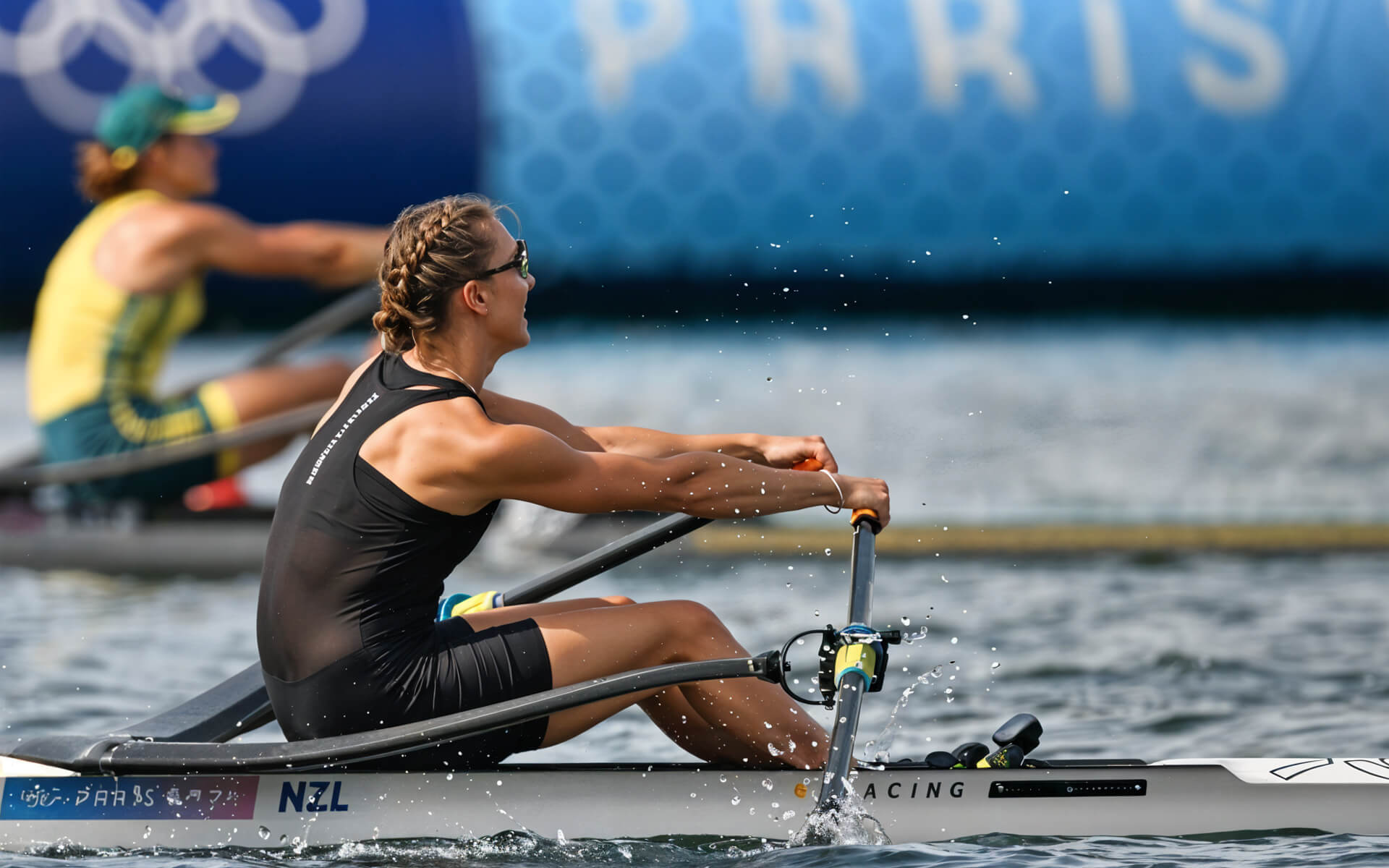
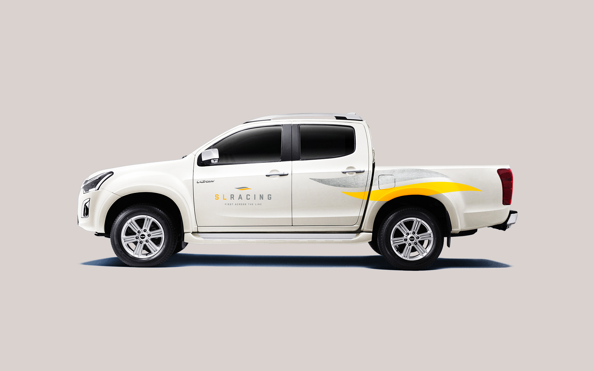
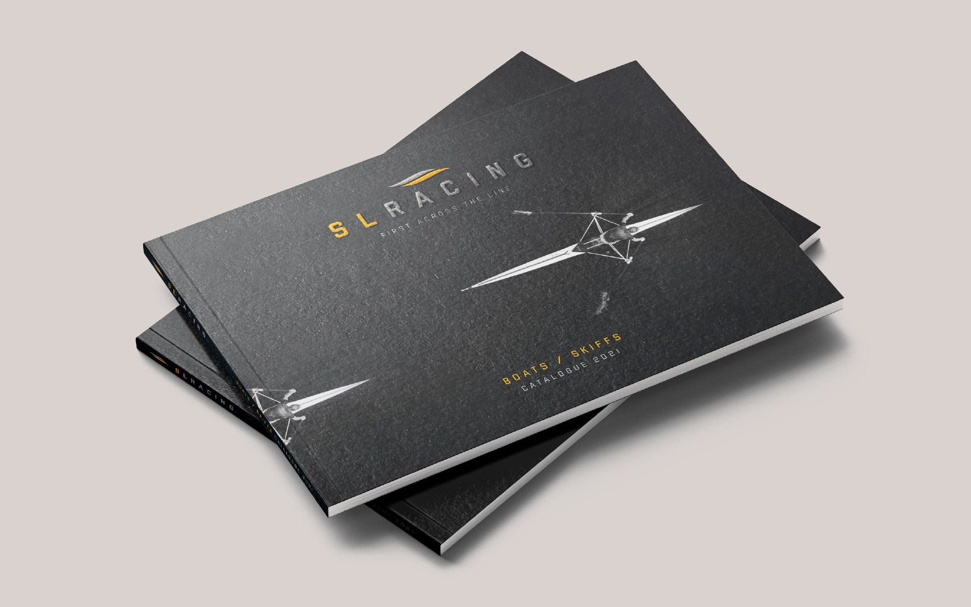
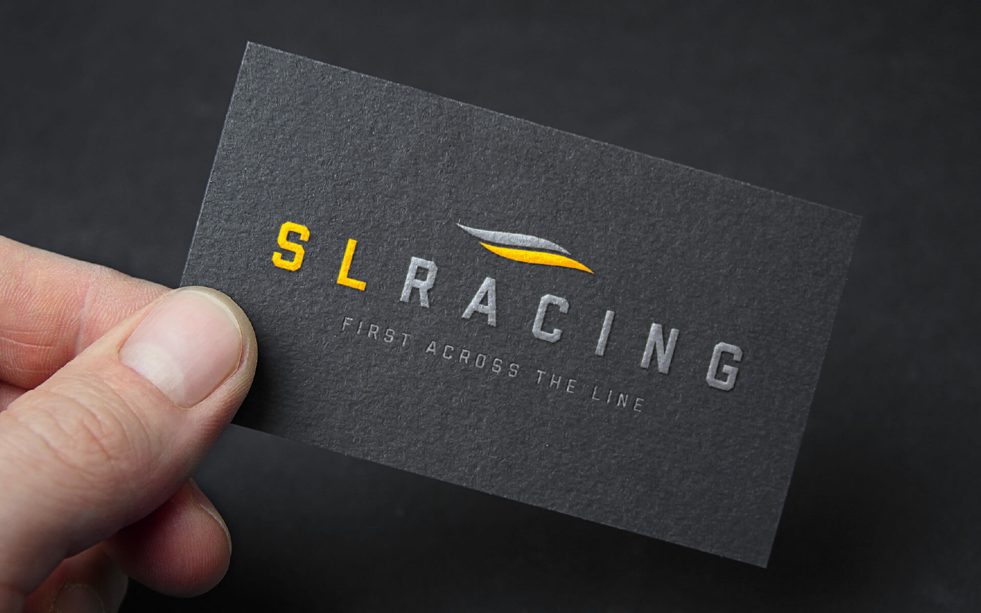
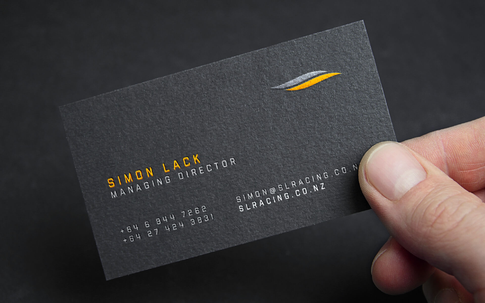
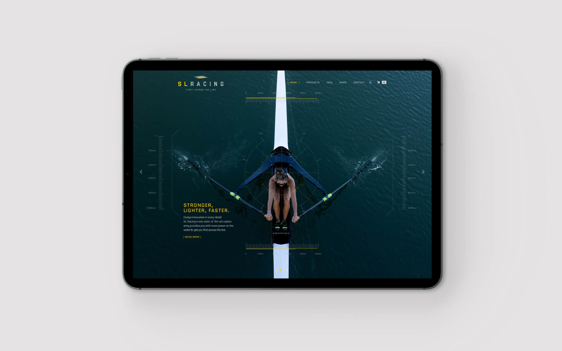
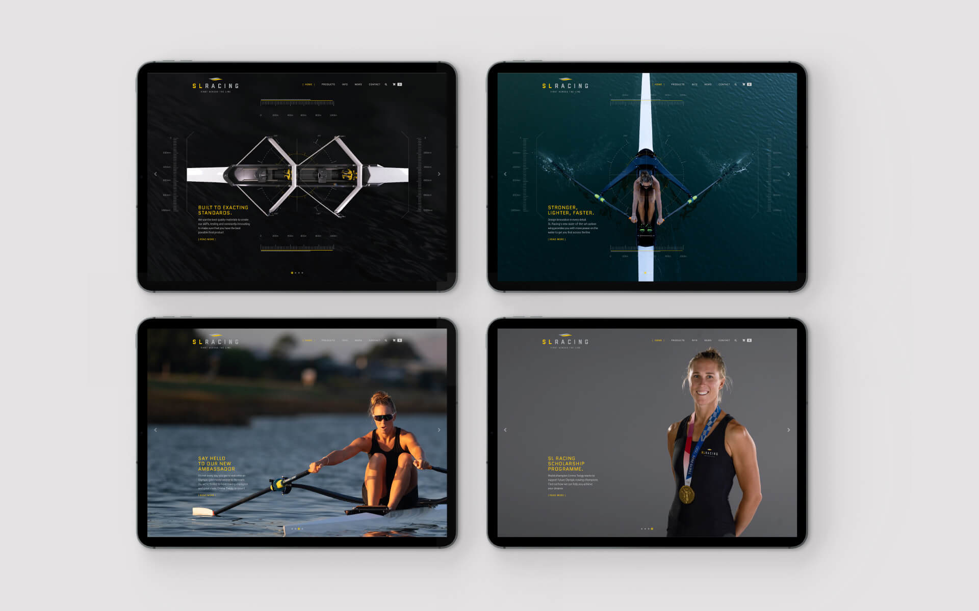
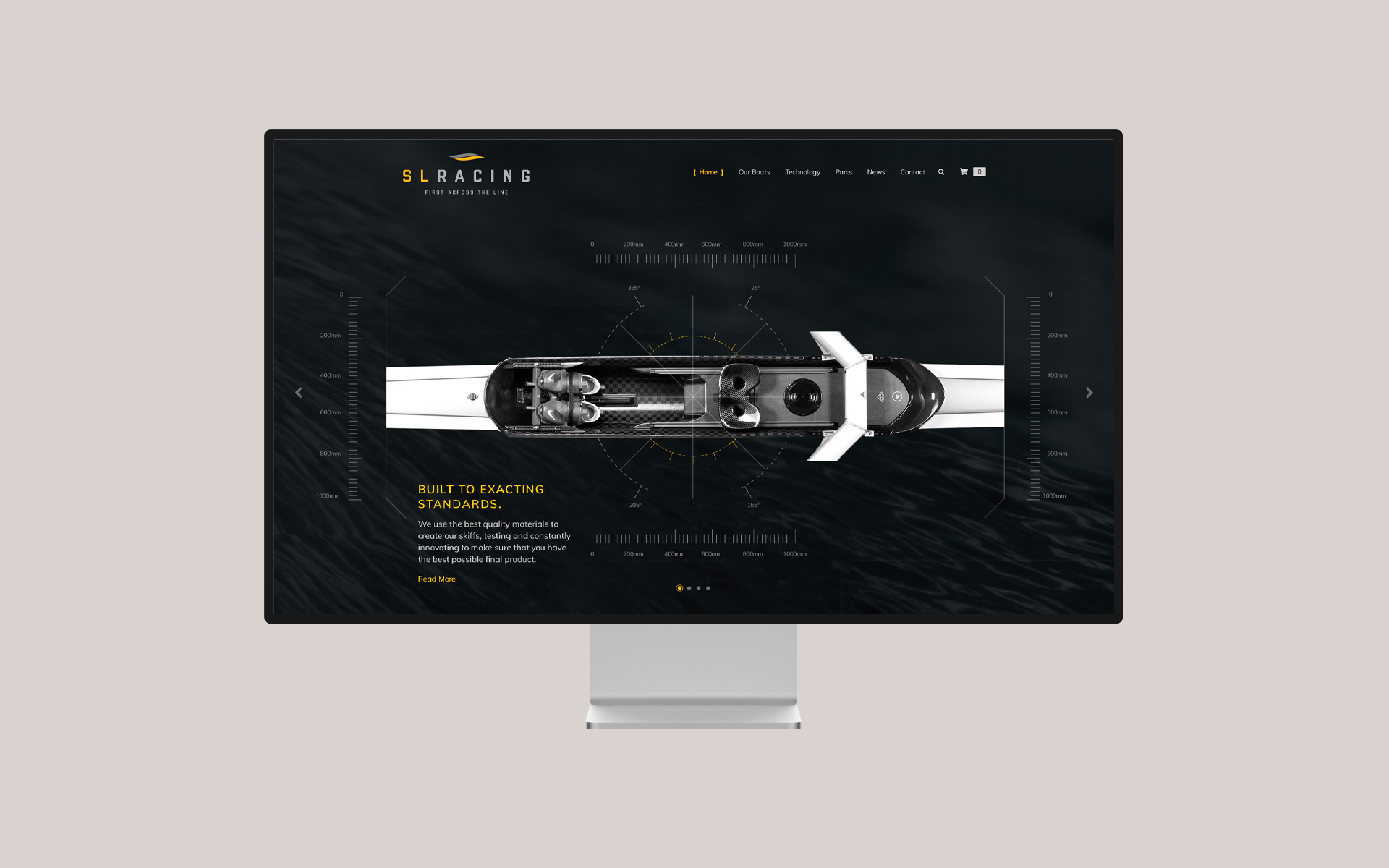
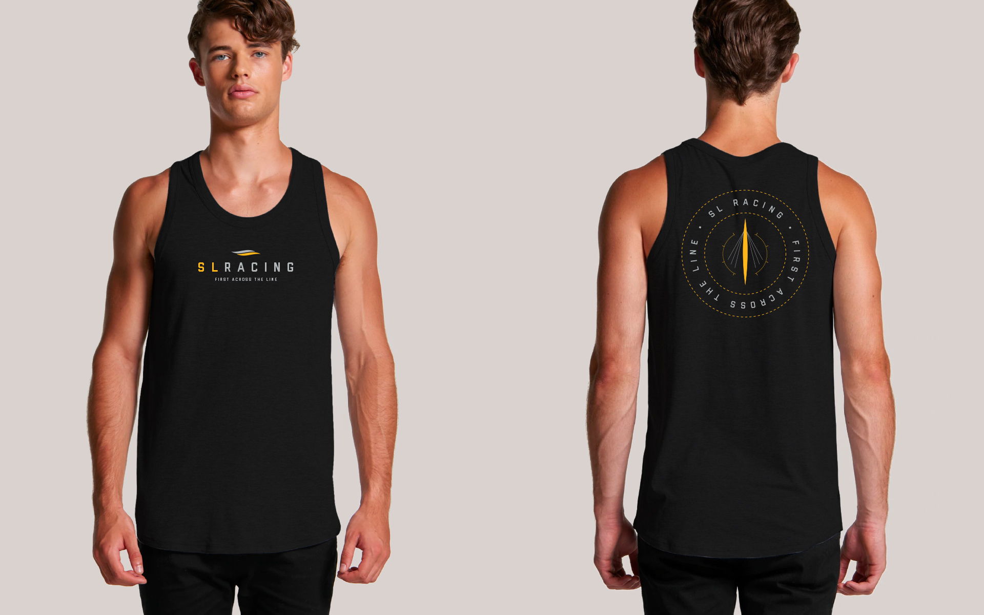
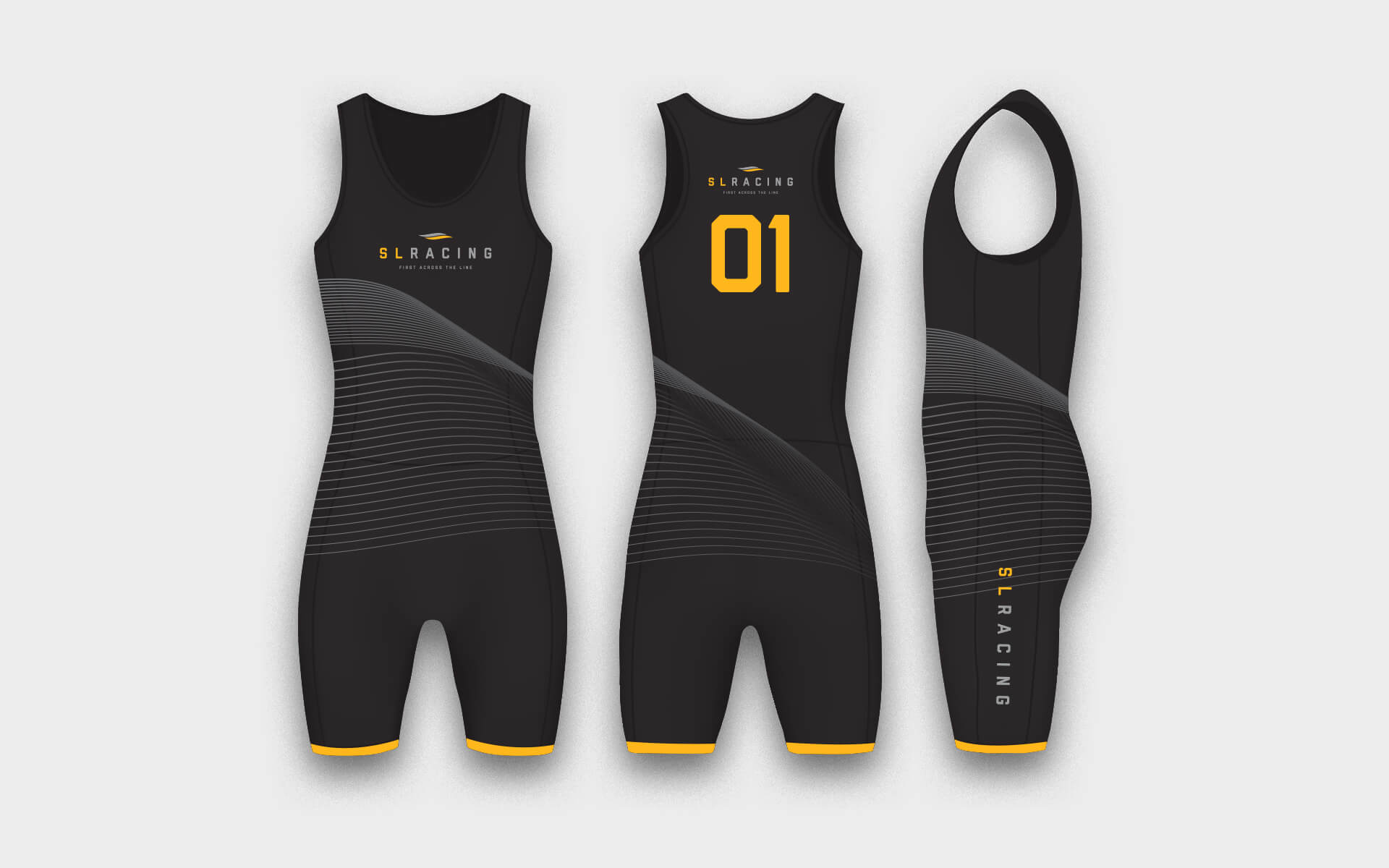
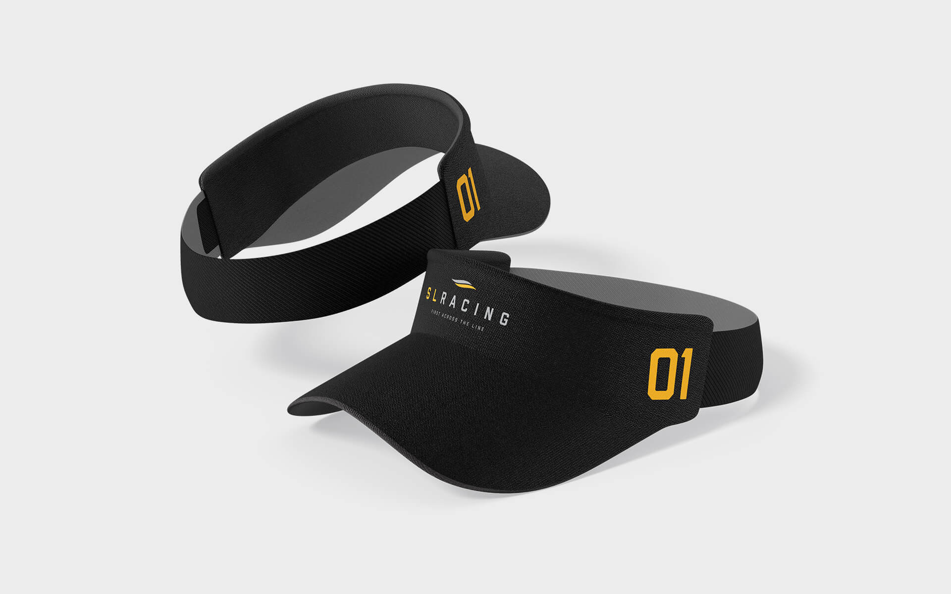
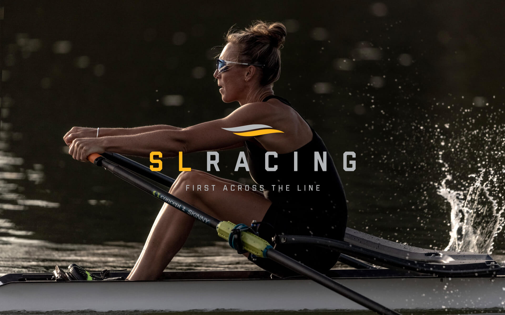
SL Racing required a fresh new face-lift for their brand that would reflect their high quality boat builds, workmanship and their moto 'first across the line'.
02.2022
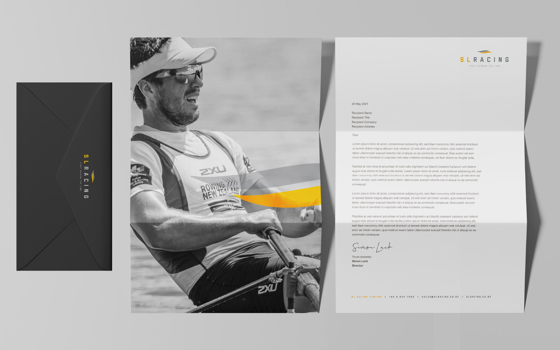
- Art direction
- Brand design
- Presentation visuals
- Website design
- In association with Many Hats
Details
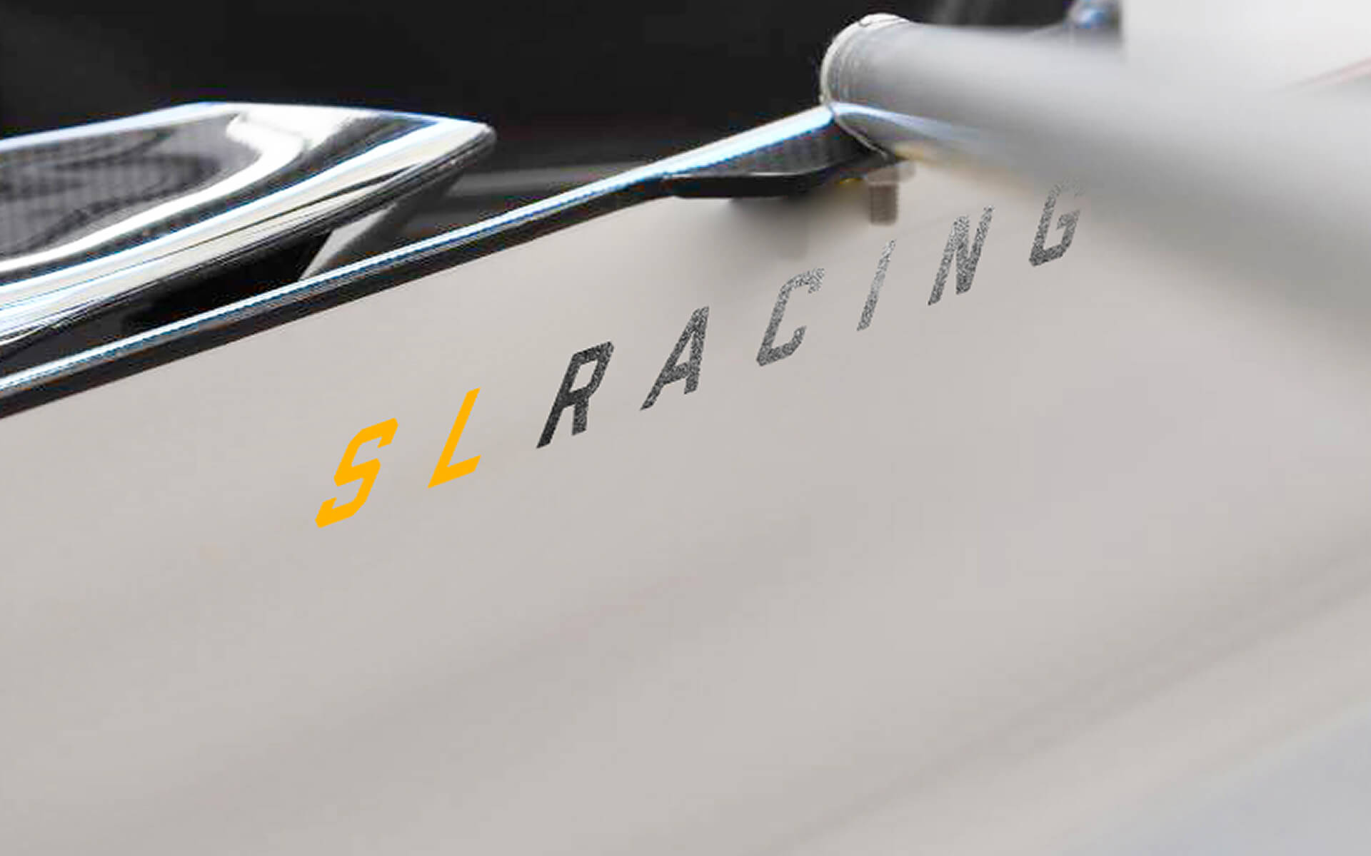
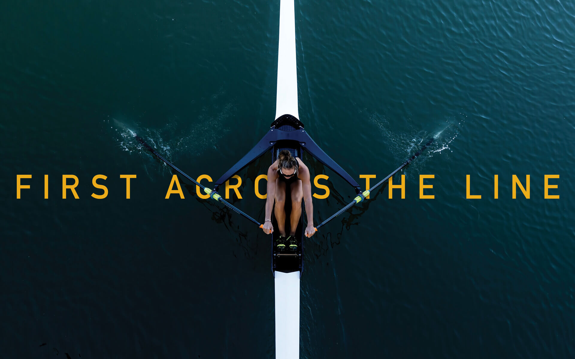
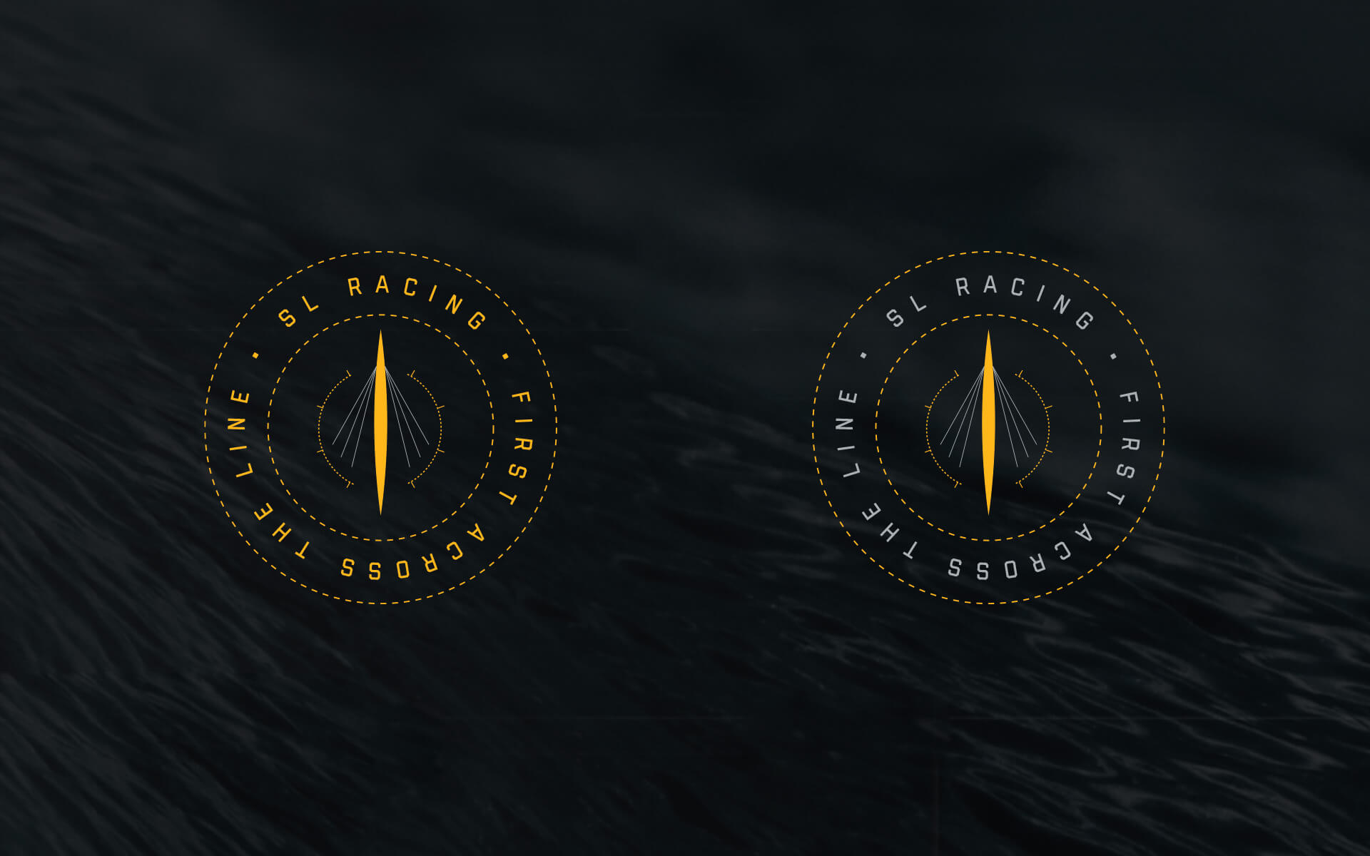
Designed to give you the leading edge.
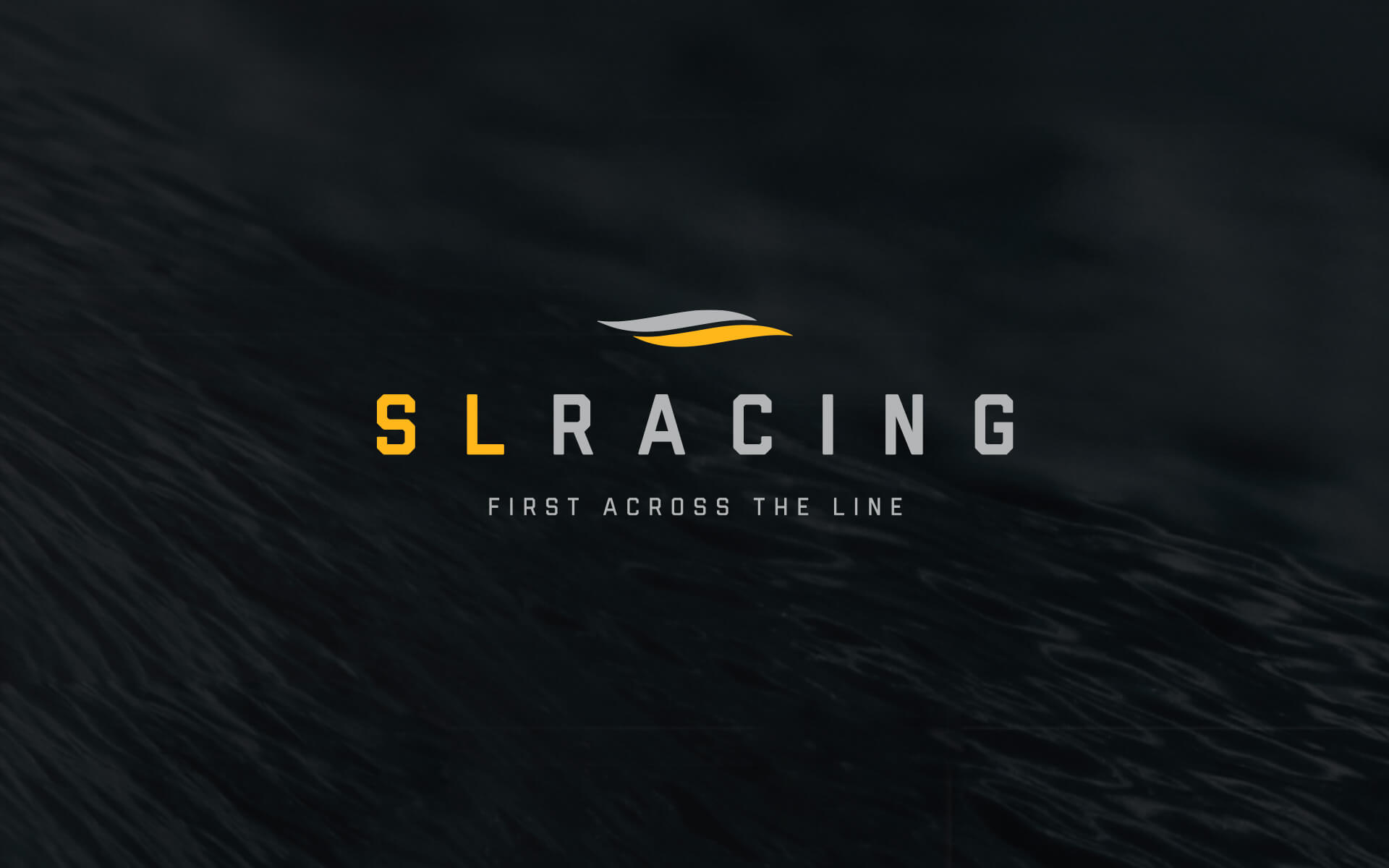
The brand was designed to be clear, sophisticated and to be used for multiple applications including racing shells and boat equipment The symbol represents movement in water and one element extending past the other to be 'first across the line'.